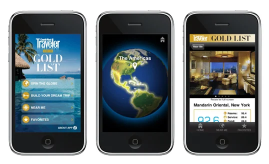
Condé Nast Traveler introduced version 4.8.1 of its Gold List app early last month. It boasts ambitious, well-executed design, with potential to boost brand interaction and drive revenue. Though there are UX flaws, we expect future versions of this app to evolve into a viable, revenue-churning machine.
Overall: 5.92
Revenue Potential: 5.5
This app has the potential to become transactional, with Condé Nast receiving a fee for bookings. But it's got a long way to go. For now, the app feels too much like an ad carousel for featured properties.
Value to Brand: 8
The app could be huge for the brand - bigger if the design was easier. Smartly curated experiences, well photographed and designed. The app feels futuristic.
User Experience: 3
UX is a bit confusing, and disappointing at times. After download, the app takes too long to load. Some features are counterintuitive. For example, pressing a phone number on the screen doesn't dial the number, but redirects to the resort website. We also wish photos had a zoom to full-screen feature. Though the app certainly looks polished, there is room for improvement.

